John Cullen
UX Design | UI Design
A heavy UX project for a B2B & B2C lighting company. The goal was to create a website that was just as functional and appealing to both businesses and consumers.
THE CHALLENGE
Building a site for both B2B and B2C has natural challenges because the two audiences expect and need different things. On top of that, John Cullen Lighting has a lot of technical information for each product to present, many ways to view that information, and options to configure products however users want on top of that. The client also wanted an exploration section of the site with style and design inspiration, urging users towards purchase.
THE RESPONSE
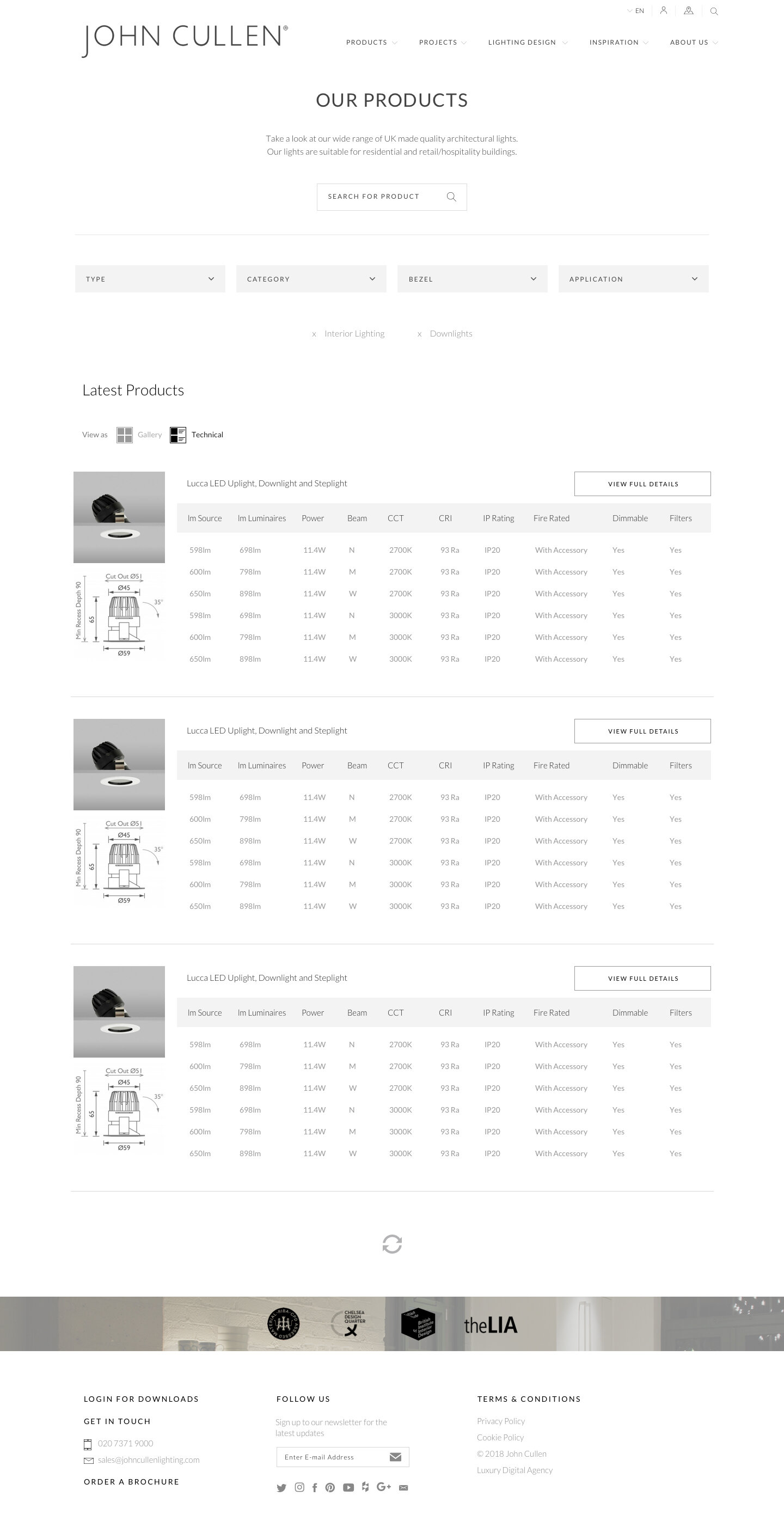
The most important part of solving this design was finding an elegant middleground between B2B and B2C. That took the form of cleanly laid out product pages that puts the core information up front, and then makes deeper information easily available if you need that. That meant no clutter, but no loss of functionality either.
That solution informed every other design decision I made: the configurator has all the straightforward UX that a B2C user needs in an attractive and smooth UI, while letting you configure the nitty gritty deep information that businesses will find more valuable. Even the explore section was all about inspiring users and guiding them towards the exact information they actually wanted.


THE THOUGHT BEHIND: THE CONFIGURATOR
The configurator was a complicated design for both UX and UI. Once a user had clicked on a product, they had the ability to change and alter that product to their exact needs. They could customise absolutely everything from the Beam Angle, to the Colour Temperature. Those choices were then filtered through what John Cullen could actually make and a table appears giving you your exact purchase options.
I designed this to be as easy to navigate and as accessible as possible. With the sheer amount of information and options, it was tricky making this usable to both B2B and B2C consumers, but I found a happy medium. The drop down menus and layout of the results table is easy to consume for regular users, and I added the option to download results as a PDF and a “Save to account” option for businesses to maintain a portal of what they need with John Cullen.
CONCLUSION
This was a really interesting challenge in appealing to two audiences - businesses and consumers - with very different needs. It all came down to information architecture and making information easily accessible, but only if the user wants it. That careful planning led to a really smooth UX and UI, and the engagement with the site speaks for itself in terms of results.
WATCH THE VIDEO


